Rec Room
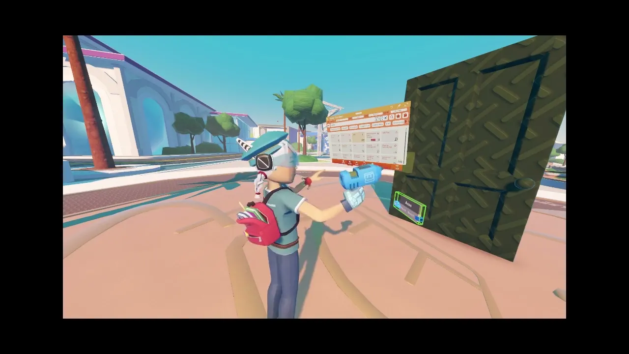
Maker Pen

Team: Maker Team

Role: UX, UI Designer, User Testing, Strategist, and Visionary.

Tools: XD, Figma, Adobe Suite, Rec Room, Unity, Sigma, Amplitude, and Hex.

Results: We significantly improved tool discoverability and added 13+ new features—including AI tools, Favorites, contextual pullout menus, a debug menu, and expanded circuit options—without requiring a full menu redesign.

The redesigned Maker Pen menu now delivers a consistent, intuitive experience across VR, console, and mobile platforms, reducing user friction and enabling faster, more seamless creation. These updates laid the groundwork for future expansion while maintaining clarity and ease of use for both new and advanced creators.

Release: 2019 - 2020

The Maker Pen is an in-app creative tool that allows creators to build experiences directly within Rec Room. As a growing company with a creative user base expanding across multiple platforms, Rec Room originally launched as a VR-exclusive platform but has since expanded to many other devices. This shift has introduced unique challenges for our creator tools, which must not only function seamlessly across current and future platforms but also support social creation. Ensuring consistency in interactions, language, and movements across devices is essential as creators collaborate in classes, build rooms, and share experiences. As our platform grows, effectively communicating techniques and tutorials across different devices becomes increasingly important.

The Maker Pen is an in-app creative tool that allows creators to build experiences directly within Rec Room. As a growing company with a creative user base expanding across multiple platforms, Rec Room originally launched as a VR-exclusive platform but has since expanded to many other devices. This shift has introduced unique challenges for our creator tools, which must not only function seamlessly across current and future platforms but also support social creation. Ensuring consistency in interactions, language, and movements across devices is essential as creators collaborate in classes, build rooms, and share experiences. As our platform grows, effectively communicating techniques and tutorials across different devices becomes increasingly important.

Design Solution

As new creation tools and features are added and deployed across multiple platforms, we face the challenge of designing a system that scales with company growth, adapts to new features, and works seamlessly across platforms without requiring a complete redesign for each release. The Maker Pen menu is a particularly complex project, requiring transitioning from an old UI interface to a new one while improving the visibility and usability of tools and settings. This ensures it meets the needs of our existing user base and future users across various platforms.

As new creation tools and features are added and deployed across multiple platforms, we face the challenge of designing a system that scales with company growth, adapts to new features, and works seamlessly across platforms without requiring a complete redesign for each release. The Maker Pen menu is a particularly complex project, requiring transitioning from an old UI interface to a new one while improving the visibility and usability of tools and settings. This ensures it meets the needs of our existing user base and future users across various platforms.

As new creation tools and features are added and deployed across multiple platforms, we face the challenge of designing a system that scales with company growth, adapts to new features, and works seamlessly across platforms without requiring a complete redesign for each release. The Maker Pen menu is a particularly complex project, requiring transitioning from an old UI interface to a new one while improving the visibility and usability of tools and settings. This ensures it meets the needs of our existing user base and future users across various platforms.

Results: We significantly improved tool discoverability and added 13+ new features—including AI tools, Favorites, contextual pullout menus, a debug menu, and expanded circuit options—without requiring a full menu overhaul.

The redesigned Maker Pen menu now delivers a consistent, intuitive experience across VR, console, and mobile platforms, reducing user friction and enabling faster, more seamless creation. These updates laid the groundwork for future expansion while maintaining clarity and ease of use for both new and advanced creators.

Key Improvements: Tool settings are now surfaced as contextual options on the main page for MVP, allowing creators to quickly access relevant settings without navigating through multiple menus or pull-out menus especially when using screen creation versus VR.

User Feedback: Long-term users appreciated the old UI's bubbly buttons and pagination but found the new menu a bit too large. To address this, we plan to add collapsible sections and tool shortcuts, allowing creators to work in virtual space without needing to open menus. Additionally, we aim to improve the flow for logic creation.

Next Steps: Before implementing collapsible features, we prioritized refining the 2D menu layout, improving left- and right-hand interactions, introducing pullout menus, and adding platform-specific shortcuts to boost creator efficiency.

Design Process

The legacy Maker Pen menu was in dire need of a redesign, primarily due to its lack of scalability. Internally, we constantly faced the challenge of figuring out where to place new buttons or how to fit additional categories within the existing structure. If the menu couldn’t expand to accommodate new tools and features, how could we possibly meet the evolving needs of our creators? This question drove the redesign process, aiming to create a more flexible, scalable menu that would allow us to deliver the tools and features creators desire, both now and in the future.

The legacy Maker Pen menu was in dire need of a redesign, primarily due to its lack of scalability. Internally, we constantly faced the challenge of figuring out where to place new buttons or how to fit additional categories within the existing structure. If the menu couldn’t expand to accommodate new tools and features, how could we possibly meet the evolving needs of our creators? This question drove the redesign process, aiming to create a more flexible, scalable menu that would allow us to deliver the tools and features creators desire, both now and in the future.

The legacy Maker Pen menu was in dire need of a redesign, primarily due to its lack of scalability. Internally, we constantly faced the challenge of figuring out where to place new buttons or how to fit additional categories within the existing structure. If the menu couldn’t expand to accommodate new tools and features, how could we possibly meet the evolving needs of our creators? This question drove the redesign process, aiming to create a more flexible, scalable menu that would allow us to deliver the tools and features creators desire, both now and in the future.

The Objective

Design a cross-platform creation menu that supports long-term growth, adapts to new features, and works seamlessly across devices without requiring a full redesign each time.

Design a cross-platform creation menu that supports long-term growth, adapts to new features, and works seamlessly across devices without requiring a full redesign each time.

Design a cross-platform creation menu that supports long-term growth, adapts to new features, and works seamlessly across devices without requiring a full redesign each time.

Understanding Creators

Creators expressed frustration with the current menu but their needs hadn’t been clearly documented or prioritized. We set out to understand:

  • What are their pain points?

  • What do they truly want from the creation experience?

  • How do their needs align with the company’s long-term vision?

Research Approach

To uncover meaningful insights, I combined first-hand research with competitive analysis:

  • 100+ user interviews & surveys to surface needs, pain points, and desires.

  • Hands-on immersion: I hosted creator classes across various devices to personally experience creation workflows.

  • Competitor analysis: Mapped other platform creation tools for feature gaps and opportunities.

Top Insights from Research

User Priorities:

  • Desire for more features and better discoverability

  • Need for cross-platform usability and customizable layouts

  • Lack of debugging tools, especially for circuits and advanced logic

Synthesizing the Research

I categorized pain points and aligned them to key feature requests. This allowed me to:

  • Identify and prioritize gaps in the existing menu

  • Build personas reflecting beginner to expert needs

  • Present actionable findings to stakeholders and guide product decisions

User Journey Maps

Beginner Creator Flow:

  • Improved onboarding through clearer tool hierarchy

  • Surfaced key tools like “This Room” and platform-specific shortcuts

  • Surface Ink Limitations and Constraints

Key Challenges
& Opportunities

Cross-Platform Consistency: Moving pull-out menus across platforms disoriented users, complicating Rec Room’s otherwise seamless, collaborative UX.

Readability: Transparent menus overlapped with content, making them hard to read and limiting new creators to basic tasks.

While the system works well across platforms, there are still opportunities for iteration and improvement. Addressing existing issues and refining the creation experience will further improve usability and ensure continued success.

Discoverability: Nested tools and the lack of contextual settings required frequent menu switching, slowing creators down.

Accessibility: The absence of tooltips and reliance on icons hindered usability for creators with visual impairments.

Old Menu Design

  • Strengths: Charming, colorful interface with familiar paginated navigation.

  • Weaknesses: Required extra steps, struggled with scaling for complex tools, and was less intuitive for new users.

Maker Pen Menu Old Architecture

Prototyping

The new Maker Pen menu was built to support Rec Room’s cross-platform experience and scalability, ensuring long-term growth while preserving the fun, creative branding that is iconic to Rec Room's culture. This deep-rooted creative identity continues to drive the platform's success in fostering creators of all skill levels.

The new Maker Pen menu was built to support Rec Room’s cross-platform experience and scalability, ensuring long-term growth while preserving the fun, creative branding that is iconic to Rec Room's culture. This deep-rooted creative identity continues to drive the platform's success in fostering creators of all skill levels.

Prototyping Stage 1

First draft of the prototype—looking for opportunities to streamline information while still allowing creators to pin settings with tools, scale tubes across platforms, explore future growth potential, and ensure layout consistency on all platforms.

Prototyping Stage 1

First draft of the prototype—looking for opportunities to streamline information while still allowing creators to pin settings with tools, scale tubes across platforms, explore future growth potential, and ensure layout consistency on all platforms.

Prototyping Stage 1

First draft of the prototype—looking for opportunities to streamline information while still allowing creators to pin settings with tools, scale tubes across platforms, explore future growth potential, and ensure layout consistency on all platforms.

New Architecture

Separated categories and surfaced them directly on the Maker Pen menu, making tools more accessible across all platforms, instead of relying on floating menus to access that information.

New Architecture

Separated categories and surfaced them directly on the Maker Pen menu, making tools more accessible across all platforms, instead of relying on floating menus to access that information.

New Architecture

Separated categories and surfaced them directly on the Maker Pen menu, making tools more accessible across all platforms, instead of relying on floating menus to access that information.

Experimented with Collapsible Menus and Vertical vs. Side Navigation

We explored collapsible menus and vertical versus horizontal navigation to reduce screen clutter and improve usability. Our goal was to create a menu that could collapse when not in use, minimizing its impact on screen visibility. However, we faced tight timelines and technical challenges due to the transition from a 3D UI to a 2D interface.

Prototyping Stage 2

After discussions with stakeholders and engineers, we moved forward with concepts that retained elements of the original UX while prioritizing growth and scalability. We enhanced usability across all platforms while preserving pull-out menus as an option for those who prefer them.

During this phase, we engaged multiple groups of creators to test the menus and provide feedback on various directions.

Prototyping Stage 3

After identifying what worked best for creators, engineers, cross-platform accessibility, and feature growth, we began the development process. We then gathered user feedback and made rapid iterations based on creator input.

Prototyping Stage 3

After identifying what worked best for creators, engineers, cross-platform accessibility, and feature growth, we began the development process. We then gathered user feedback and made rapid iterations based on creator input.

Prototyping Stage 3

After identifying what worked best for creators, engineers, cross-platform accessibility, and feature growth, we began the development process. We then gathered user feedback and made rapid iterations based on creator input.

Prototyping for a User-Centered Experience

The new Maker Pen menu was built to support Rec Room’s cross-platform experience and scalability, ensuring long-term growth while preserving the fun, creative branding that is iconic to Rec Room's culture. This deep-rooted creative identity continues to drive the platform's success in fostering creators of all skill levels.

The new Maker Pen menu was built to support Rec Room’s cross-platform experience and scalability, ensuring long-term growth while preserving the fun, creative branding that is iconic to Rec Room's culture. This deep-rooted creative identity continues to drive the platform's success in fostering creators of all skill levels.

The new Maker Pen menu was built to support Rec Room’s cross-platform experience and scalability, ensuring long-term growth while preserving the fun, creative branding that is iconic to Rec Room's culture. This deep-rooted creative identity continues to drive the platform's success in fostering creators of all skill levels.

Features for Scalability

To accommodate different workflows across platforms, we implemented features like pull-out menus, menu pinning, and scalable menu sizes. These changes not only improve current workflows but also provide a foundation for future features, ensuring the Maker Pen menu evolves with creator's needs.

To accommodate different workflows across platforms, we implemented features like pull-out menus, menu pinning, and scalable menu sizes. These changes not only improve current workflows but also provide a foundation for future features, ensuring the Maker Pen menu evolves with creator's needs.

To accommodate different workflows across platforms, we implemented features like pull-out menus, menu pinning, and scalable menu sizes. These changes not only improve current workflows but also provide a foundation for future features, ensuring the Maker Pen menu evolves with creator's needs.

Iterative Design Through Prototypes

Partnering with the UI team, I developed multiple prototypes using the new UI system. These prototypes tested consistent interaction patterns, ensuring creators could easily adapt to the updated menu. Interactive prototypes were tested in-app to validate usability, helping identify how creators navigated tools, completed tasks, and rediscovered familiar workflows.

Partnering with the UI team, I developed multiple prototypes using the new UI system. These prototypes tested consistent interaction patterns, ensuring creators could easily adapt to the updated menu. Interactive prototypes were tested in-app to validate usability, helping identify how creators navigated tools, completed tasks, and rediscovered familiar workflows.

Partnering with the UI team, I developed multiple prototypes using the new UI system. These prototypes tested consistent interaction patterns, ensuring creators could easily adapt to the updated menu. Interactive prototypes were tested in-app to validate usability, helping identify how creators navigated tools, completed tasks, and rediscovered familiar workflows.

Balancing Workflows

Through testing and close collaboration with creators, we identified various workflows, including, basic creation, creating art, organic designs, circuits, and room testing. Each workflow has unique needs.

Through testing and close collaboration with creators, we identified various workflows, including, basic creation, creating art, organic designs, circuits, and room testing. Each workflow has unique needs.

Through testing and close collaboration with creators, we identified various workflows, including, basic creation, creating art, organic designs, circuits, and room testing. Each workflow has unique needs.

Incorporating Familiarity

To support these workflows, we introduced a way to pull out menus, a nod to the old design that some creators enjoyed. This proved especially beneficial for circuit creators, who often switch between configuration and search menus simultaneously while editing and configuring. Since circuit creators typically remain stationary during their work, this flexibility improves their efficiency.

To support these workflows, we introduced a way to pull out menus, a nod to the old design that some creators enjoyed. This proved especially beneficial for circuit creators, who often switch between configuration and search menus simultaneously while editing and configuring. Since circuit creators typically remain stationary during their work, this flexibility improves their efficiency.

To support these workflows, we introduced a way to pull out menus, a nod to the old design that some creators enjoyed. This proved especially beneficial for circuit creators, who often switch between configuration and search menus simultaneously while editing and configuring. Since circuit creators typically remain stationary during their work, this flexibility improves their efficiency.

Addressing Testing Needs

Room testers, on the other hand, require mobility and collaboration. They often need both hands free and multiple people in the room. To support this, we ensured testing logs could remain open without closing when the Maker Pen isn’t in use.

Room testers, on the other hand, require mobility and collaboration. They often need both hands free and multiple people in the room. To support this, we ensured testing logs could remain open without closing when the Maker Pen isn’t in use.

Room testers, on the other hand, require mobility and collaboration. They often need both hands free and multiple people in the room. To support this, we ensured testing logs could remain open without closing when the Maker Pen isn’t in use.

Overview

We retained the familiar layout and systems that users were accustomed to while updating the creation menu to align with the new interactions and layouts implemented across our new app interfaces. This consistency in user patterns ensures a seamless UX across platforms, allowing both long-time and new users to navigate menus effortlessly without needing to adapt to entirely different interaction methods between creation versus other in app menus.

The creation menu successfully launched on multiple platforms, including the Nintendo Switch, without requiring a redesign. This cross-platform consistency allowed users to create, communicate, and collaborate seamlessly, enabling friends and community members to teach, learn, and connect regardless of their platform. This approach has been a significant success. Not only does it function effectively across current and future platforms, but it also empowers our internal team to add and expand features without the need for a complete redesign.

While the system works well across platforms, there are still opportunities for iteration and improvement. Addressing existing issues and refining the creation experience will further improve usability and ensure continued success.

Design · UX/UI · Product Design · Branding

Crafting
impact-driven experiences

2025 by Meriesa

Design · UX/UI · Product Design · Branding

Crafting
impact-driven experiences

2025 by Meriesa

Design · UX/UI · Product Design · Branding

Crafting
impact-driven experiences

2025 by Meriesa